Earlier this week, the Bureau of Labor Statistics released the Job Openings and Labor Turnover Survey (JOLTS) covering September 2022. This latest readout on the labor market accords with our recent economic analysis highlighting the useful information provided by the fill rate (the ratio of job openings to hires). This month’s report shows extremely high rates of job openings; based on either the fill rate or the ratio of job openings to unemployment, the labor market is very hot.
However, the two measures suggest different gaps between the current strength in the labor market and what a more sustainable level would be:
- The openings-to-unemployment ratio (known as the Beveridge Curve) suggests substantial tightness and the need for a much higher unemployment rate to achieve a sustainable and more-typical level of job openings.
- The fill rate, on the other hand, suggests less tightness and therefore less need for a substantial softening of the labor market.
The fill rate shows that firms looking to hire large numbers of workers are indeed expanding employment at a rapid pace—because hires are also relatively high firms are clearly finding available workers. In contrast, while the Beveridge Curve has been moving in the direction of less tightness since July as the number of openings per unemployed has declined, that measure suggests that the matching of workers to jobs has dramatically worsened.
In this analysis we show that the rate of job openings has been more in line with its historical relationship to the hires rate than its relationship to the unemployment rate. Given labor market dynamics since 2021, getting the openings rate back to a more sustainable pace implies a hires rate in line with the 2015 hires rate but an unemployment rate more than double its 2015 rate.
The two ratios—job openings-to-hires and job openings-to-unemployment—have a track record of explaining price and wage pressure. However, we find that inflation appears to be more sensitive to changes in the openings-to-hires ratio than the openings-to-unemployment ratio. On one hand, this means that elevated openings relative to hires have done more to contribute to inflation; on the other hand, it means that as openings come down relative to hires price pressure should moderate.
Because the unemployment rate does not fully capture the pool of potential workers right now—many are coming straight into jobs from outside the labor force or are quitting their jobs to take new ones—the unemployment rate should not be the only indicator policymakers incorporate into their understanding of the labor market. We reiterate that if the labor market today is indeed quite hot (many job openings are available) and only moderately tight (many of those openings are getting filled) then the unemployment rate may not need to rise dramatically for the labor market to move to a more sustainable level.
How is the rate of job openings related to other labor market indicators?
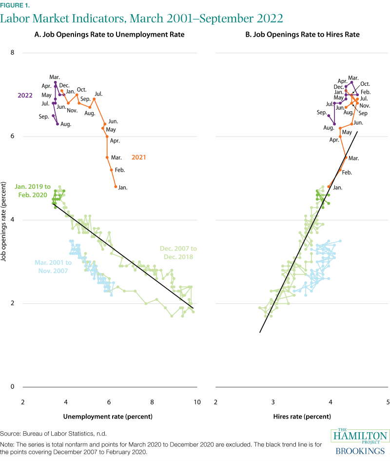
Figure 1a shows the Beveridge Curve (job openings-to-unemployment), and Figure 1b shows the fill rate (job openings-to-hires). Both measures have been used to examine the tightness of the labor market, although the Beveridge Curve is better known and tracked. Any one of the inputs into these ratios—the unemployment rate, job openings rate, and hires rate—is less informative about labor market tightness than when they are combined.

In our recent economic analysis, we find that the labor market looked considerably less tight from the vantage point of the fill rate (Figure 1b) rather than the Beveridge Curve (Figure 1a), though both have been moving modestly in recent months in the “less tight” direction. The data through September are consistent with that interpretation: both the job openings-to-unemployment ratio and the fill rate remain very high. But the job openings-to-unemployment ratio suggests a more significant change in labor market dynamics from before the pandemic. Not only is the ratio high, but it is well above a level implied by pre-pandemic relationships (the straight black line), suggesting that the unemployment rate would need to rise sharply to achieve a more sustainable labor market. The fill rate is also high but is less above its trend; as seen in calculations below, that suggests that a sustainable labor market can be achieved through a more moderate softening in conditions.
There are several factors that are contributing to the substantial differences between the implied labor market tightness from the Beveridge Curve and that from the fill rate. Relative to the last business cycle, transitions directly into employment from being out of the labor force are high, and, excluding the period just prior to the pandemic, transitions from out of the labor force into unemployment are low. This trend generally increases as the unemployment rate falls, but the extent it is occurring now is relatively elevated. The quits rate is quite high, but flows from employment to labor force nonparticipation are only somewhat elevated. The share of the employed holding multiple jobs has been increasing since early 2021. These patterns all imply that an elevated number of people taking jobs are not coming from the ranks of the unemployed. If the pool of potential hires is larger than suggested by the pool’s historical relationship to the typical indicator of labor market tightness—active job seekers without a current job, i.e., the unemployed—then the fill rate becomes that much more important to track.
The fill rate suggests less labor market softening is needed to achieve a sustainable pace
By the Beveridge Curve (Figure 1a), if the total nonfarm job opening rate were to return from its current rate of 6.5 percent to its 2019 average of about 4.5 percent, recent history—the pattern over 2021 and 2022—would suggest an unemployment rate over 10 percent. In other words, the labor market currently appears to be so tight that a stable pace of hiring dynamics implies the unemployment rate would need to almost triple from September’s level.
For the fill rate (Figure 1b), the pattern over 2021 and 2022 is more consistent with the past two decades, at least relative to the Beveridge Curve. According to the job openings-to-hires relationship, to achieve a stable rate of job openings there could be less disruption in the labor market than is commonly thought. If the job opening rate were to return to its 2019 average, recent history points to a nonfarm hires rate of 3.6 percent, down from the current rate of 4.0 percent and consistent with the pace of hiring in 2014 and 2015.1 Returning to the 2014–15 labor market would be far less disruptive than an unemployment rate of 10 percent, and a labor market like that of 2009–10.
Both indicators help explain inflation and wage dynamics
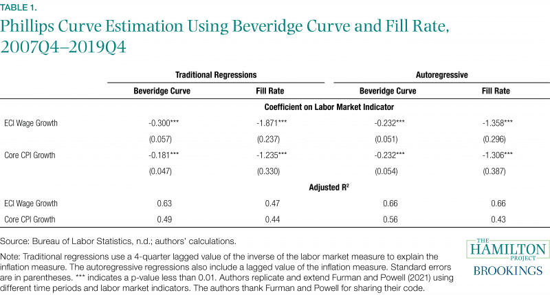
Both the Beveridge Curve and the fill rate help explain price and wage inflation. Table 1 shows these relationships based on regressions (Phillips Curve equations) of different measures of inflation on the ratios (or more precisely, the inverse of the ratios). Price inflation is measured by the Consumer Price Index excluding food and energy (core CPI inflation), and wage inflation is measured by the Employment Cost Index (ECI). Models were also estimated using lagged values of inflation (the autoregressive model in the table). We estimate these relationships on pre-pandemic data, from the fourth quarter of 2007 to the fourth quarter of 2019.

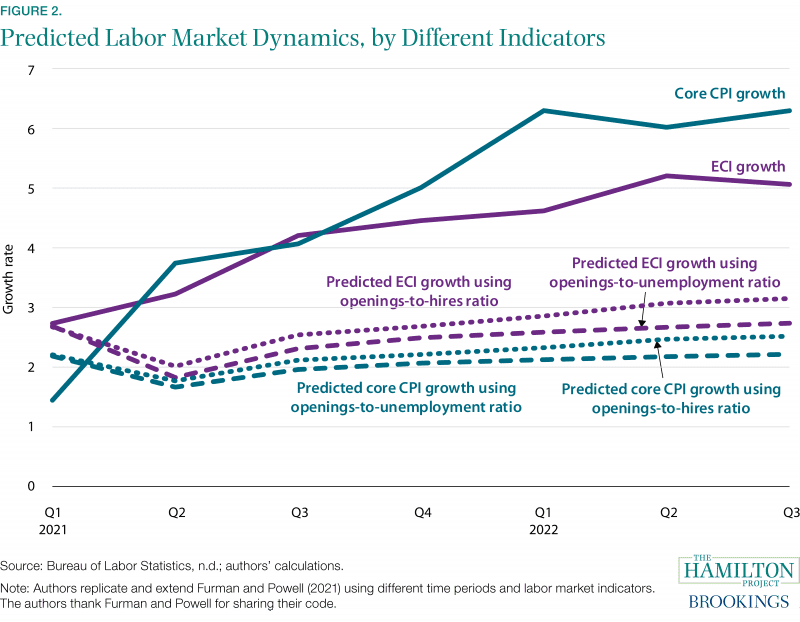
Figure 2 shows inflation rates based on core CPI (teal) and the ECI (purple) alongside predicted values from the models we estimate using the openings-to-unemployment (dashed line) or the openings-to-hires ratios (dotted line). One should interpret the “predicted” lines in the figure as the estimated contributions of labor market tightness to the pickup in inflation.
- First, predicted values are quite flat, reflecting the well-documented fact that inflation was only weakly related to labor market measures over the 2007–2019 period—the period that we use to estimate the relationship between the labor market indicators and inflation.
- Second, using the 2007-19 relationship to make out-of-sample predictions in 2021 and 2022 shows that price and wage inflation are somewhat more sensitive to the recent movements in the openings-to-hires ratio; that is, the dotted lines show greater contributions to predicted inflation than the dashed lines.
- Third, for the most part recent increases in either labor market ratio suggest little additional upward pressure on inflation; for example, predicted core CPI inflation remains at or below 2.5 percent in the third quarter of 2022, only marginally higher than in the second quarter.
- Finally, because of the greater sensitivity of predicted inflation to the fill rate, a decline in this measure to pre-pandemic levels would likely reduce future inflation more than would a decline in the openings-to-unemployment ratio.
In other words, moderate declines in the fill rate point to greater easing of inflation than do moderate declines in the openings-to-unemployment ratio.

1 These calculations are based on relationships estimated from January 2021 through September 2022. If instead we exclude the data points from January to March 2021, which have a notable amount of leverage in the estimations, then the relationships from April 2021 through September 2022 point to a substantially higher unemployment rate and a moderately lower hires rate that would be consistent with a job openings rate of 4.5 percent. The 2007 to 2019 data point to an unemployment rate of 3.2 percent and a hires rate of 3.9 percent consistent with a job openings rate of 4.5 percent.
Acknowledgments: We thank Stephanie Aaronson and Brad Hershbein for their excellent comments and Jason Furman and Wilson Powell III for making publicly available their Phillips Curve programs. We thank Aidan Creeron and Lucas Fox for their research assistance. Lastly, the authors would like to thank Jeanine Rees for her graphic design support.


